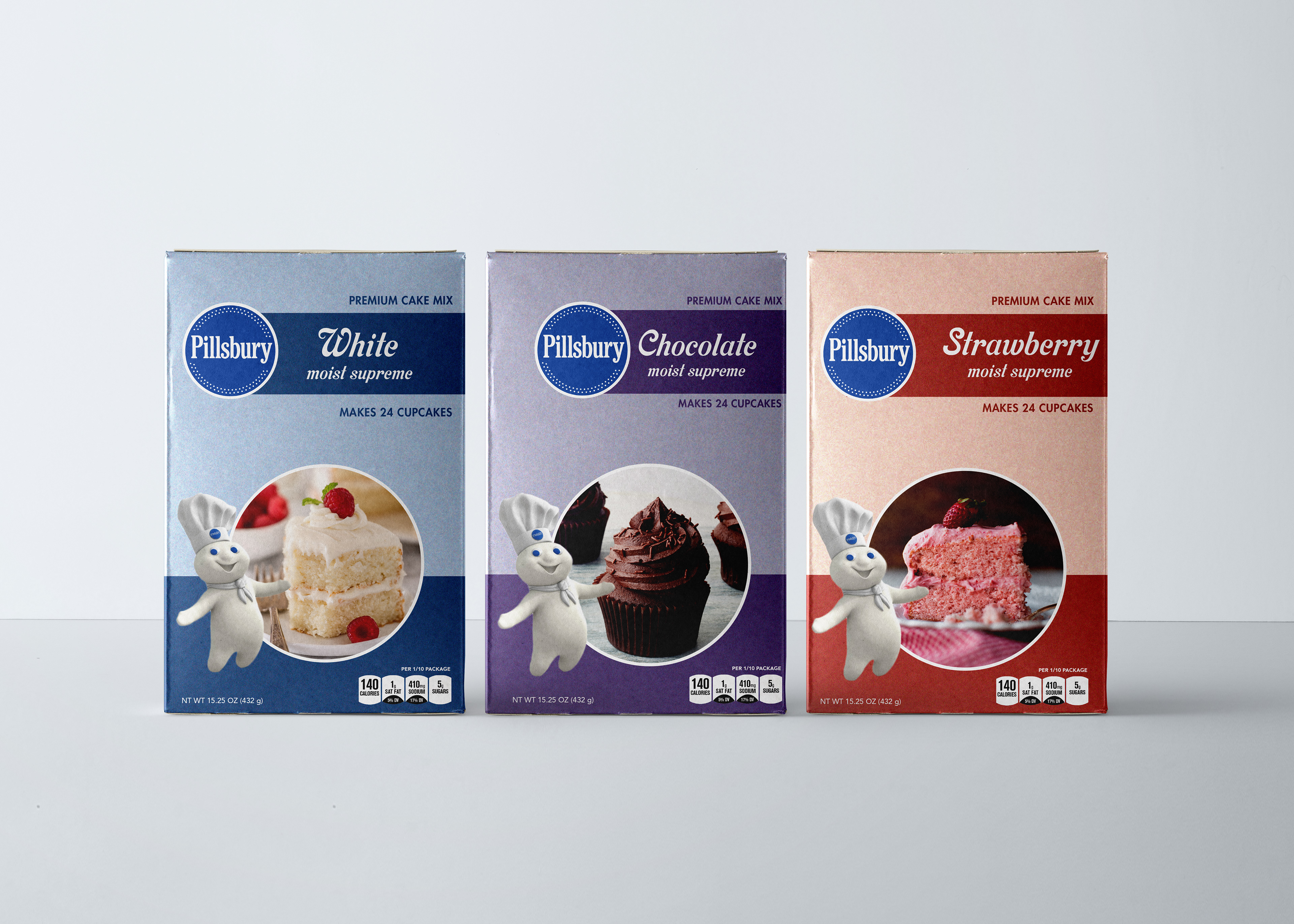
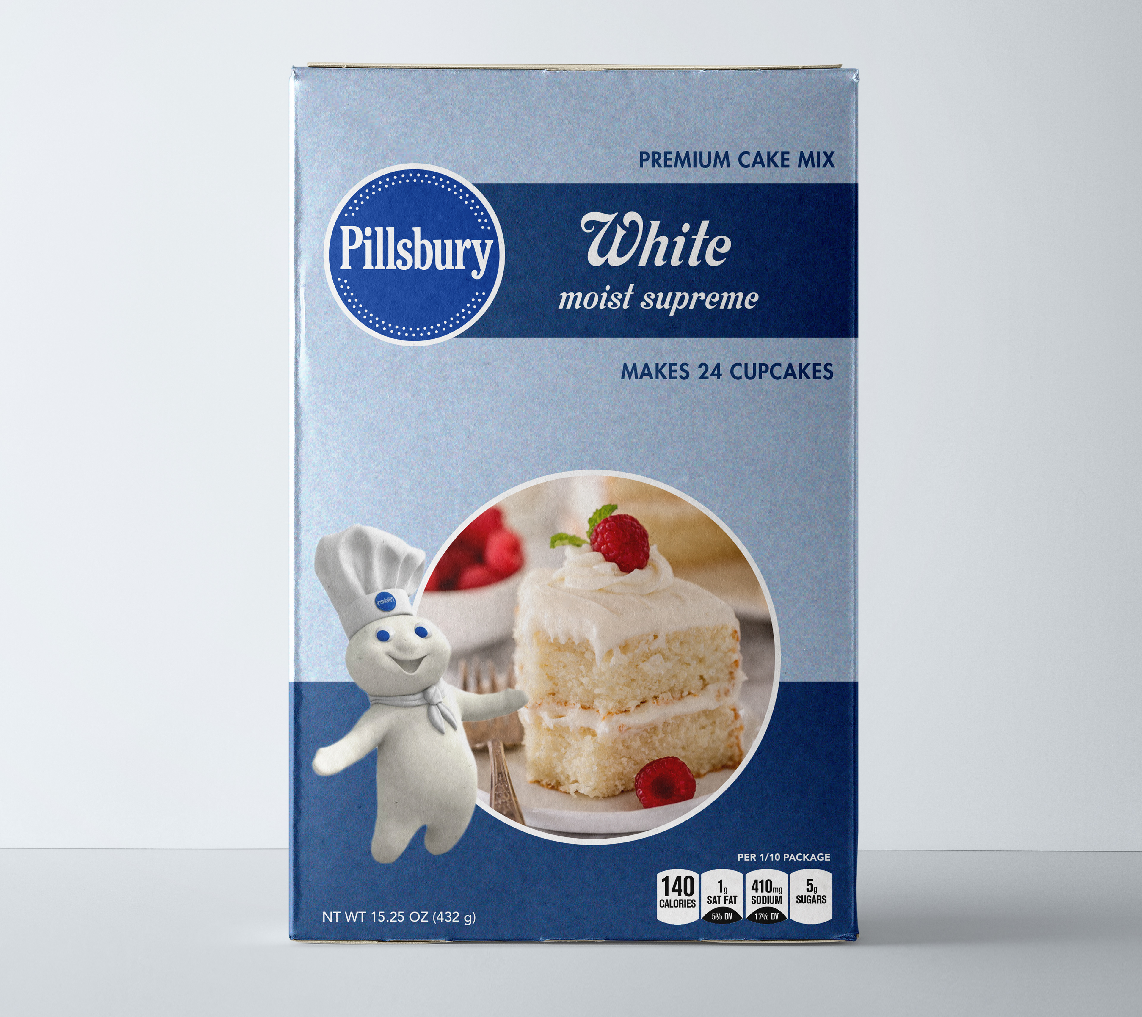
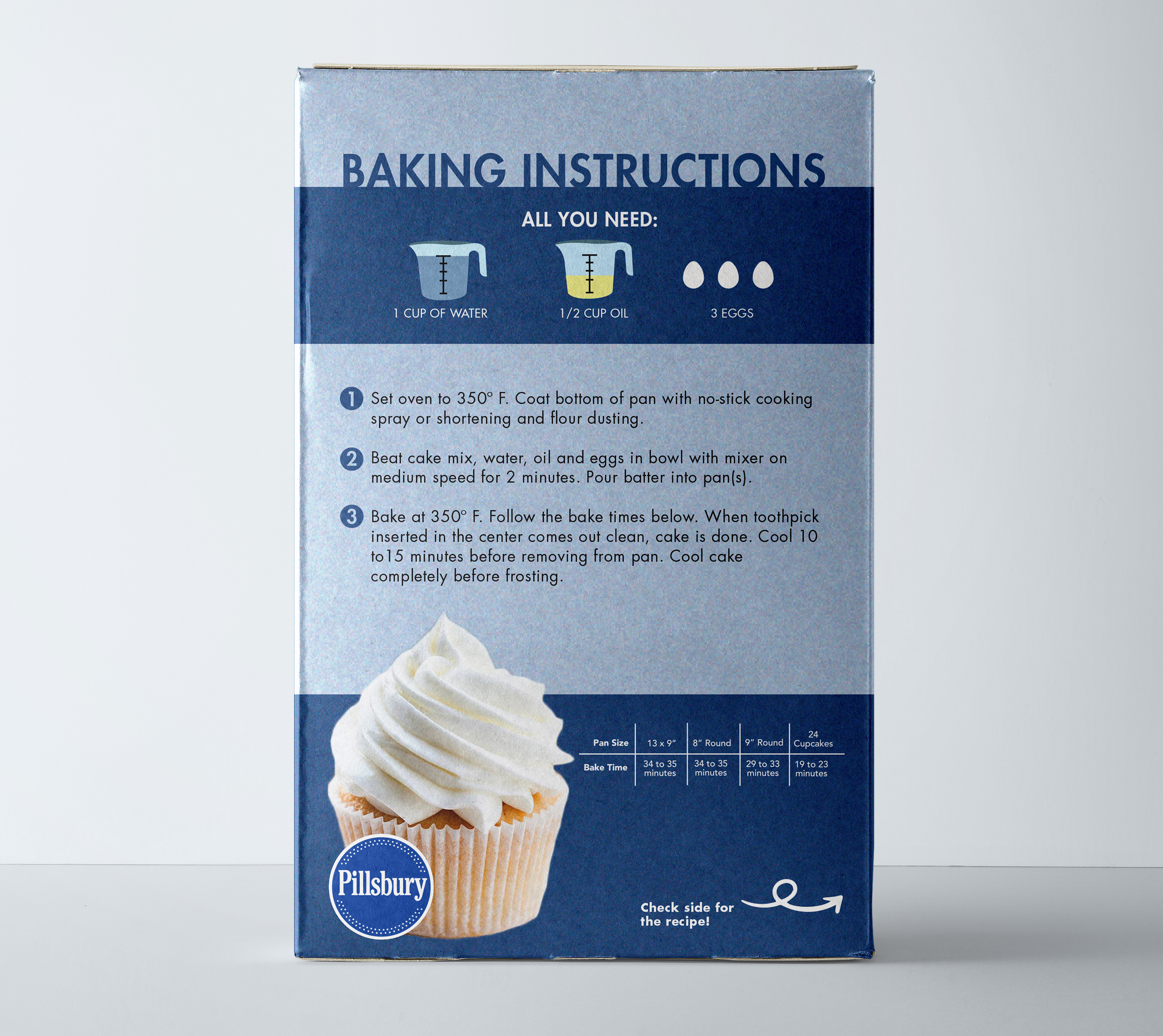
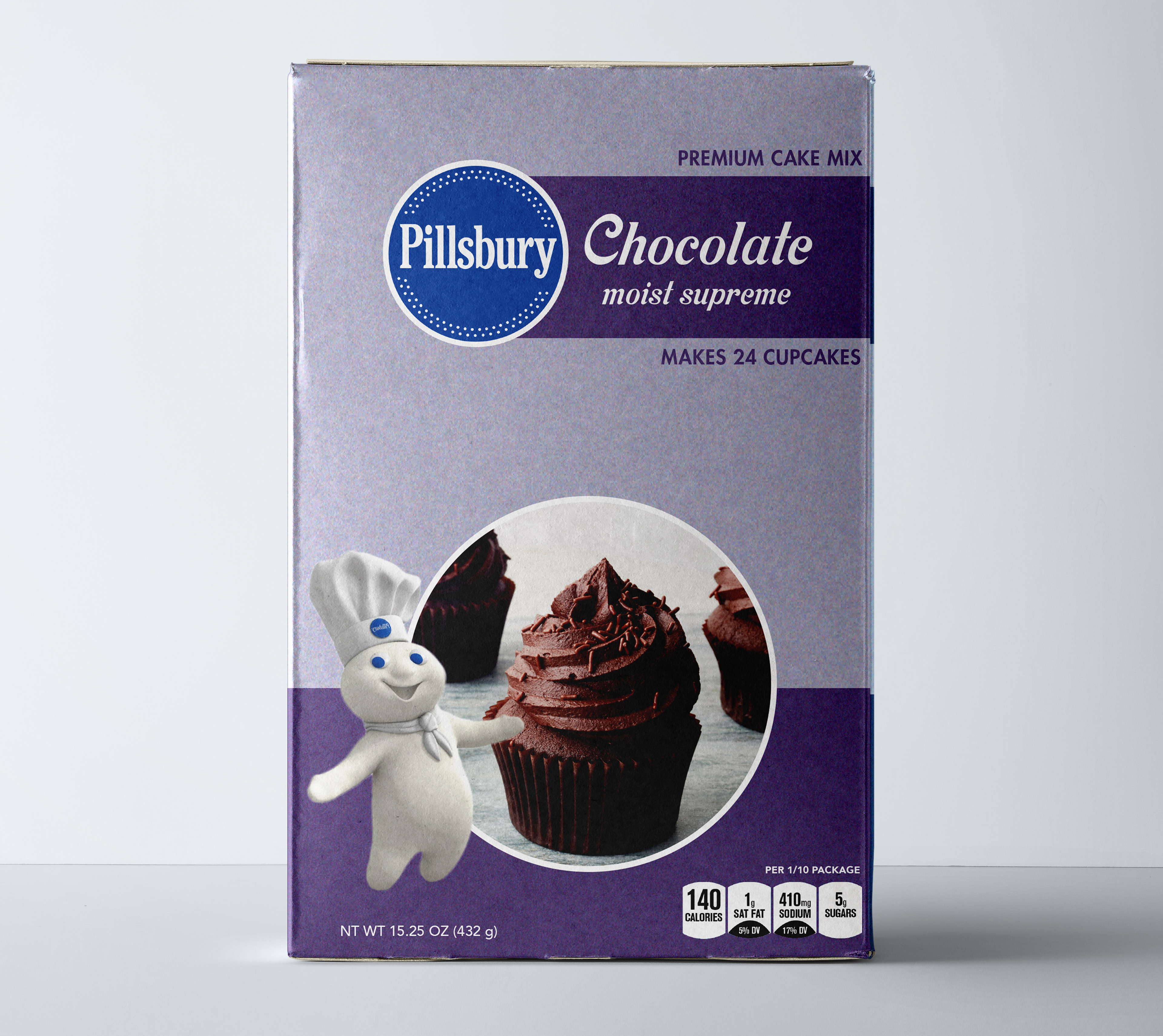
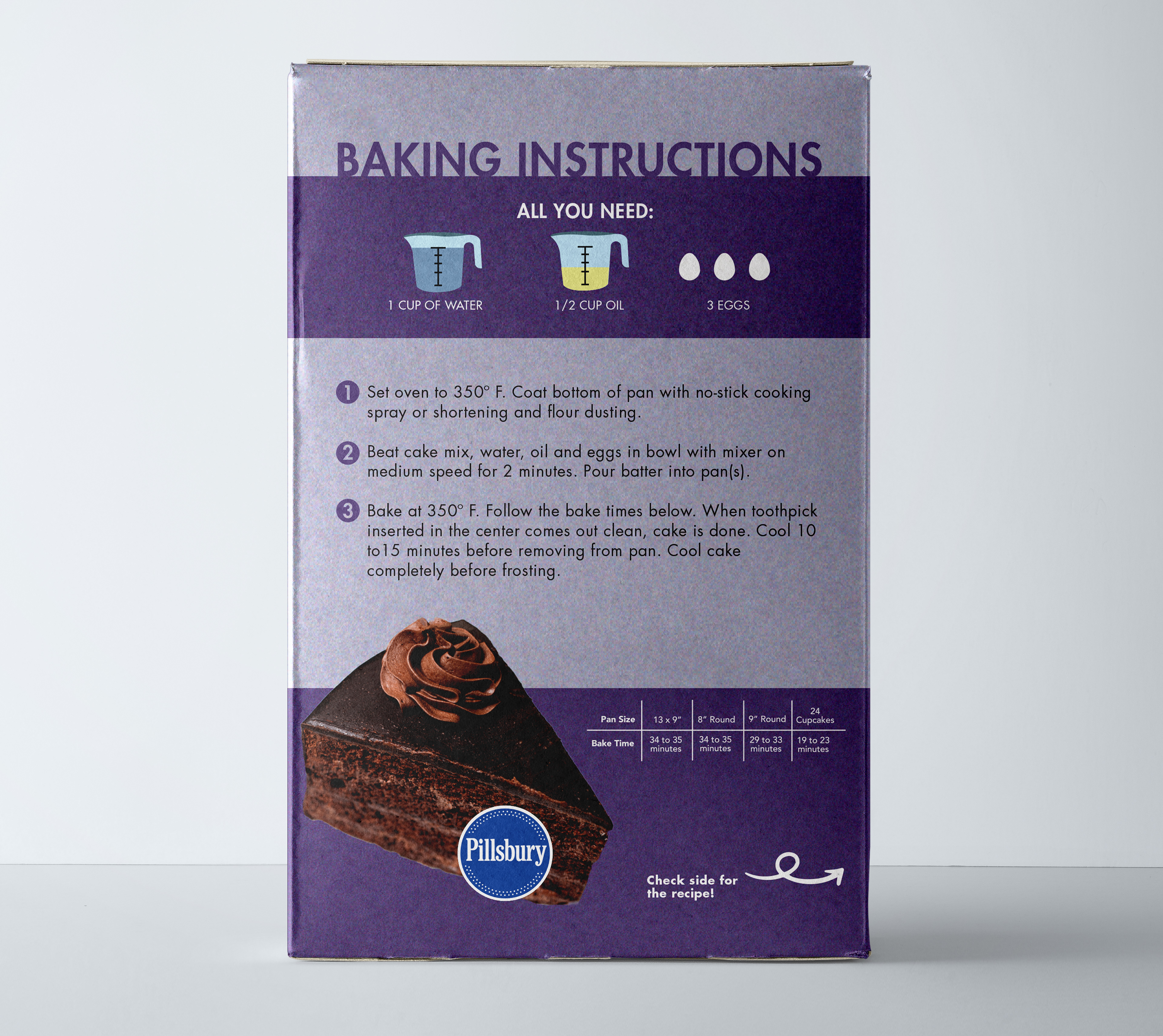
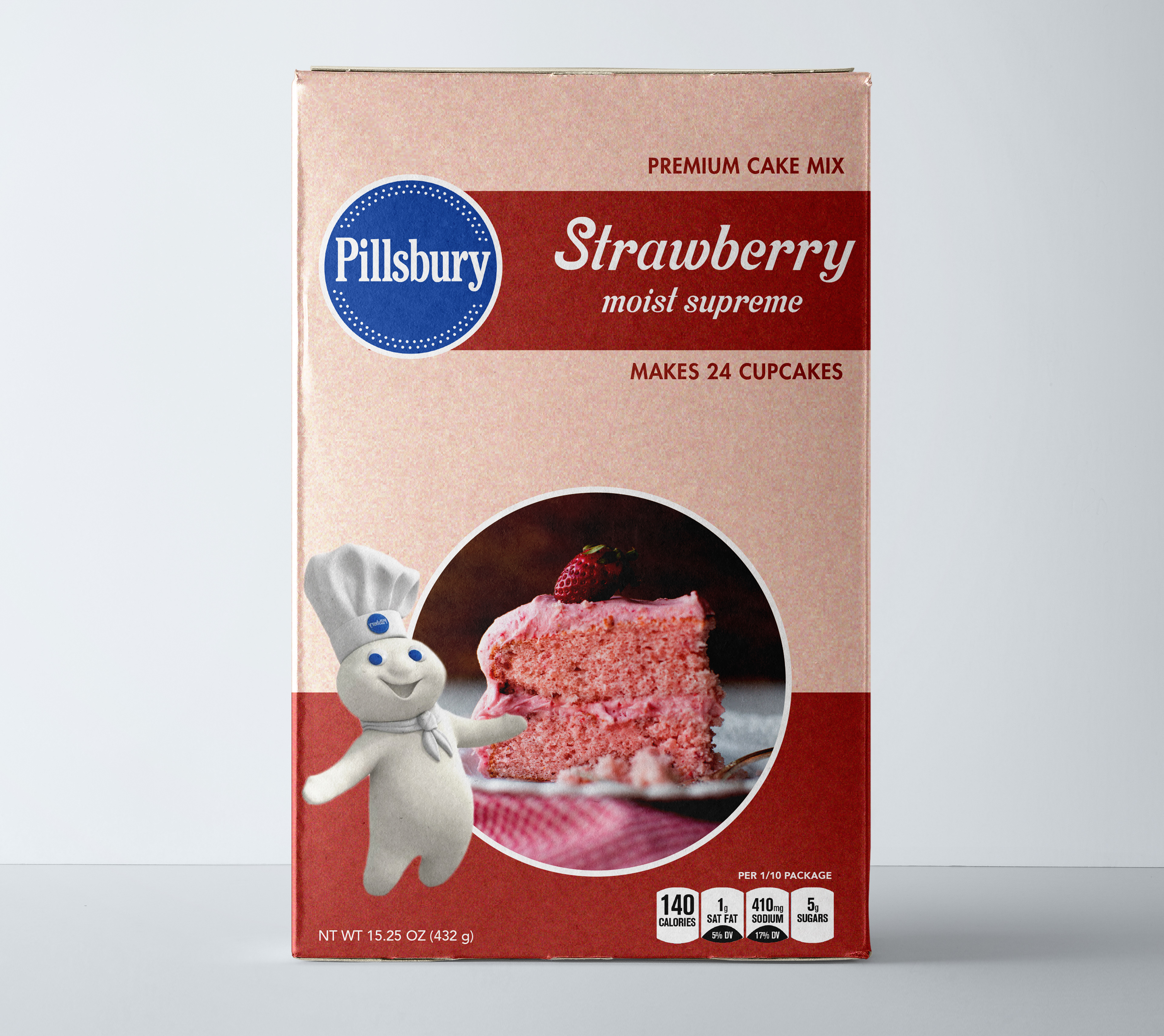
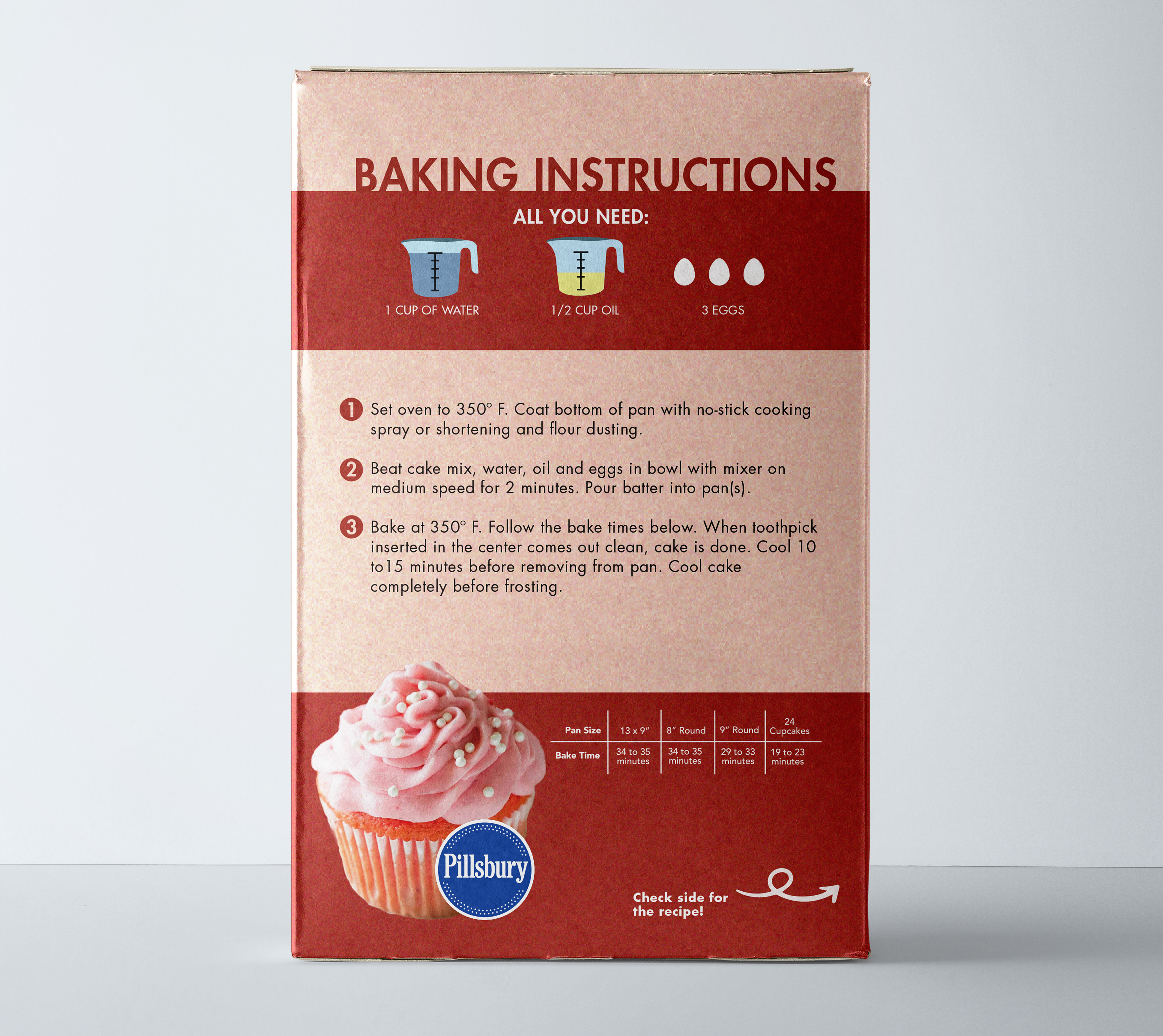
Redesign of packaging series for Pillsbury cake mixes. Emphasis on brand values and playful nature of the Pillsbury brand.
This sequence was meant to showcase how the visual aspects of a package affects how the customers approach a purchase. With a name as recognizable as Pillsbury, it was important to include their most significant branding visuals, such as the logo and Pillsbury Dough Boy, to maintain brand loyalty and perceived quality of goods.
